Overview
Overview answers one question at a glance: how are the declarations in my scope doing this period? Five figures across the top give the headline, and the tiles below show the corridor, the trend, how far declarations get, the busiest countries and the time spent at each border.
Nothing on this screen is a form. You read it, then open the screen that tells you more.
Who can see this screen
Anyone whose account can read declarations or analytics: the Secretariat, State Party administrators and REC administrators. What the figures cover depends on your organisation.
How to open it
- Select Overview in the header.
- Or open All areas and select Overview under Work.
The screen has two tabs: Analytics, described here, and Failed Transmissions, described in Failed transmissions.
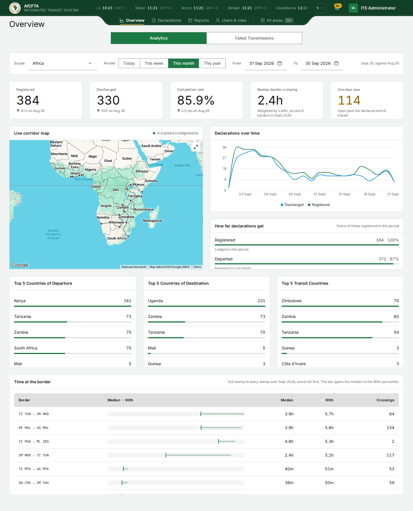
What you see depends on who you are
| You are | Scope shows | The figures cover |
|---|---|---|
| The Secretariat | Africa | Every declaration on the continent |
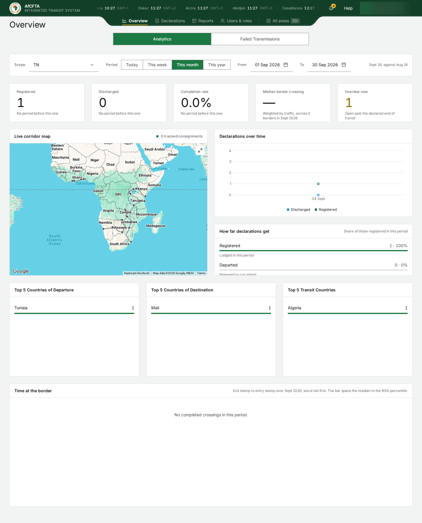
| A State Party | Your country's code, for example TN | Declarations touching your territory |
| A REC | IGAD (community), with one entry per member below it | All your members together, or the one you choose |
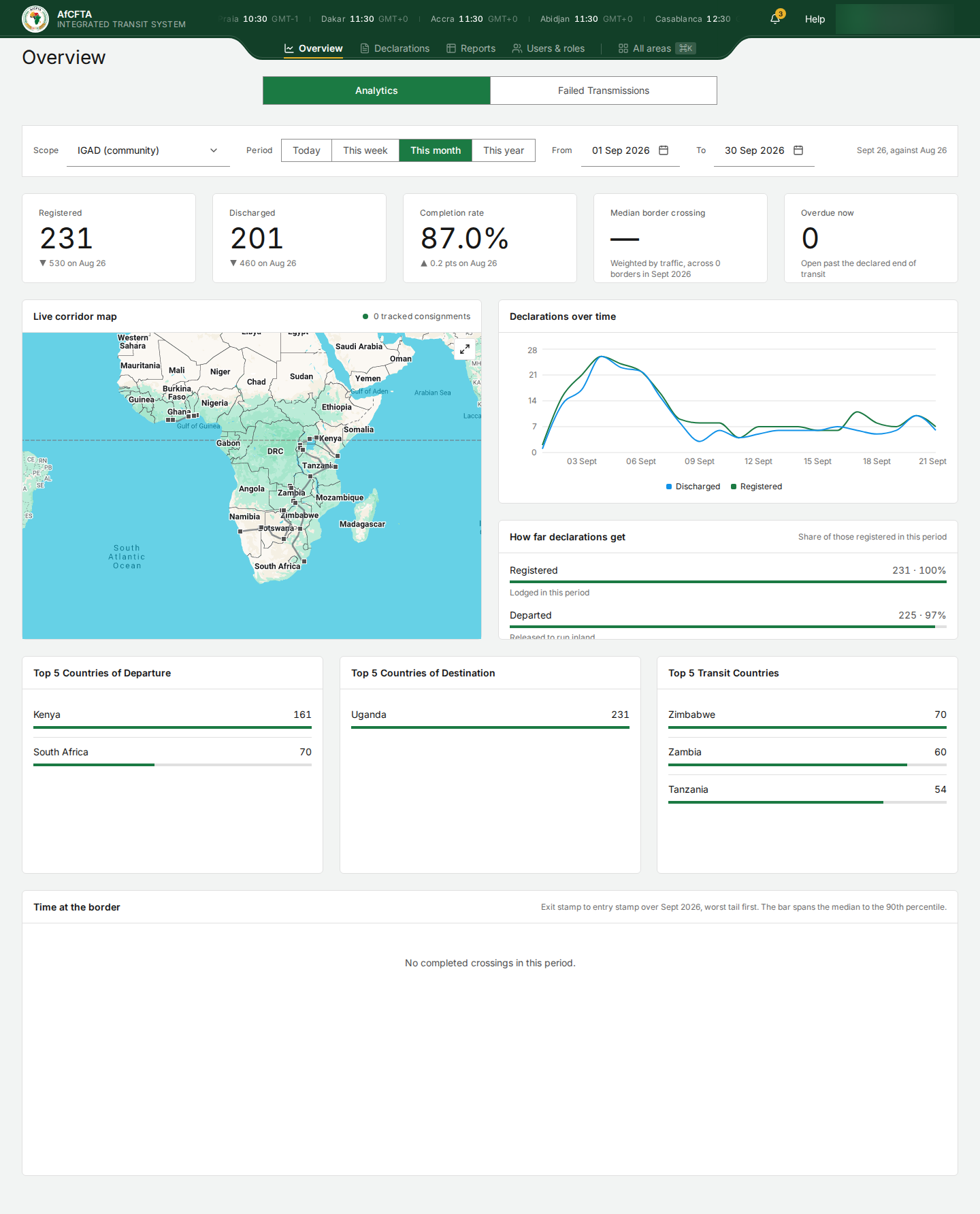
For a REC, the Overview's figures, top countries and trend come from the reporting service's list of the REC's members, which can differ from the list ITS uses for the register. The IGAD screenshot above counts 231 declarations from Kenya and South Africa to Uganda, while the same account's Declarations register, restricted to Djibouti, Eritrea and Ethiopia, is empty and none of those declarations can be opened. Until this is fixed, check a REC's figures against its register before quoting them.
The filters
| Filter | What it does |
|---|---|
| Scope | Whose declarations are counted. It has one option for the Secretariat and for a State Party; a REC can choose the whole community or one member |
| Period | Today, This week, This month or This year. This month is selected when the screen opens |
| From / To | The exact days counted. Choosing a Period fills them in; you can also pick dates yourself |
| The caption on the right | Which period is being compared with which, for example Sept 26, against Aug 26: September 2026 against August 2026 |
The five headline figures
| Figure | What it counts |
|---|---|
| Registered | Declarations lodged in the period |
| Discharged | Declarations closed in the period |
| Completion rate | Discharged as a share of registered |
| Median border crossing | The typical time from one country's exit stamp to the next country's entry stamp, weighted by traffic, and how many borders it covers |
| Overdue now | Declarations still open after their transit window closed, right now. It ignores the period |
Under each figure, the small line compares it with the period before: ▼ 413 on Aug 26 means 413 in August.
- This month counts the month so far, but compares it with the whole of the previous month. Early in a month, every figure shows ▼.
- ▼ 0.0 pts means no change, although the arrow points down.
- Sept 26 means September 2026, not 26 September.
- The Discharged figure and the Discharged row of How far declarations get can differ by a few: they are counted in different ways. The funnel follows only the declarations registered in the period.
Selecting Overdue now opens the Declarations register, but not filtered to the overdue ones: the register has no overdue filter. Use the Register report's overdue worklist instead; see Reports.
The tiles
| Tile | What it shows |
|---|---|
| Live corridor map | The corridor stations in your scope and, when electronic seals report, the consignments being tracked. The count at the top right, 0 tracked consignments, is how many positions are live. The arrows button at the top right opens it full screen |
| Declarations over time | Registered (green) and discharged (blue) per day across the period |
| How far declarations get | Of the declarations registered in the period, how many reached Departed, Arrived and Discharged. Scroll inside the tile for the lower rows |
| Top 5 Countries of Departure, of Destination, Transit Countries | The busiest countries in each role |
| Time at the border | For each border crossing, the median and the 90th-percentile time from exit stamp to entry stamp, worst first, and how many crossings |
The tiles load one after another. Loading… in a tile means it has not arrived yet; the funnel can take fifteen seconds. If a tile says it could not be read, the rest of the page is still current: select Try again.
A row of Time at the border reads as the two sides of the crossing: TZ TUN → ZM NKD is from Tunduma in Tanzania to Nakonde in Zambia.
The map reads 0 tracked consignments on every installation seen so far, even with many consignments open, because no electronic seal platform is reporting positions yet. The stations drawn on the map are real; some are drawn twice.
When the screen is empty or broken
| What you see | What it means | What to do |
|---|---|---|
| Loading… in the figures | The figures have not arrived yet | Wait up to fifteen seconds |
| — in Median border crossing | No crossing was completed in the period | Widen the period |
| No completed crossings in this period. | The same, for the Time at the border tile | Widen the period |
| No period before this one under a figure | There is nothing earlier to compare with | Nothing |
| Some readings are unavailable | One or more tiles failed to load | Select Try again; the other tiles are current |
| Analytics are unavailable | None of the readings loaded | Reload. If it persists, report it with the reference shown |